Tasks
The Tasks experience provides a focused way to engage with task items.
Benefits
Using the Tasks Experience has several benefits:
- The Tasks Experience user interface (UI) enables you to focus on tasks in isolation, rather than viewing the entirety of the Rapid site.
- This can provide further security, as some employees might only need to access their Tasks (as opposed to being able to access the entirety of a Rapid site). This functionality can, however, be implemented using Permissions.
- The Tasks Experience has Light/Dark Mode functionality built directly into its UI.
- The Tasks Experience may render better on devices will a narrow screen, such as iPads.
- Tasks Experience integrates closely with Adaptive Designer, allowing forms to be created for all Tasks, and specialised forms to be created for certain Task Inheritances and Subtypes.
The need to design specific Adaptive Documents for items in the Tasks Experience means that this is a more advanced and complex solution. Thus, it may not be suitable for your company.
Accessing the Tasks Experience
Via Direct URL
Your System Administrator may have provided you with a link to the Tasks Experience, or created a link to it as a Sidebar menu button. Alternatively, you can also visit the Tasks Experience by visiting the following URL in your web browser:
https://tasks.rapidplatform.com/_env/tenant/site
Important: You must replace _env/tenant/site with your Rapid environment, tenant, and site. To determine what your environment, tenant, and site are, refer to the table below, or read the Accessing Your Site article.
| Term | Explanation | Example |
|---|---|---|
| Environment | This determines whether you are accessing the production database of your site, or the test database. | This will usually be set to /_prod/ in order to access the production database. However, if you wish to access the test database of your site via the Tasks Experience, you would replace this with /_test/ |
| Tenant | This is the subdirectory that follows the top-level domain (.com/), in your site's URL. | If I examine the following URL from my site: https://app.rapidplatform.com/rapidplatform/mysite/, then /rapidplatform/ is the tenant, because it follows .com/. |
| Site | This is the subdirectory that follows your site's tenant. | In the above example, /mysite/ is the site's name, because it follows the tenant's subdirectory (/rapidplatform/) |
Ensure that no other subdirectories are included in the URL when navigating to the Tasks Experience.
For example, the following URL will cause an error, because of the addition of /tasks%portal at the end of the URL:
https://tasks.rapidplatform.com/_prod/rapidplatform/mysite/tasks%portal
Instead, remove all additional subdirectories, and the Tasks Experience should load as expected:
https://tasks.rapidplatform.com/_prod/rapidplatform/mysite/
Via Login Wizard
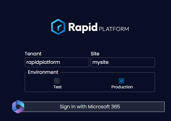
Alternatively, you are able to navigate to the base URL for the Tasks Experience, and use the Login Wizard to access the tasks for your particular site.
To do this, navigate to https://tasks.rapidplatform.com and then enter your tenant and site information. You must also choose your environment via checkbox.
- You can find your login credentials by reading the Accessing Your Site article.
It is preferable to navigate to your tasks experience using direct URL, to avoid needing to use the wizard each time you wish to access your tasks.
Tasks Experience Layout
When you first open the Tasks Experience, it will look like the example below:
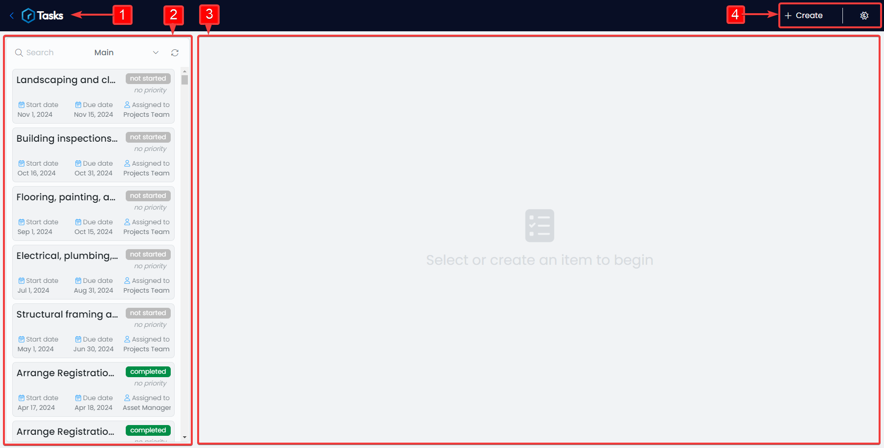
What follows is an explanation of the labels that annotate the screenshot:
- Menu Bar
Clicking on the Tasks Logo or Arrow beside it will return you to the Login Wizard. This Menu Bar has additional functionality when an item is opened.
- List Toolbar
This allows you to search for tasks, change your view, refresh the list of tasks, and navigate through the tasks you are permitted to see.
- Tasks Form Area
Here is where the Adaptive Form for a particular task will appear. This Adaptive form will need to be created by your System Administrator, otherwise the area will display a message asking you to create the form.
- + Create and Light/Dark Mode
You can create new tasks with the + Create button, and change the appearance of the Tasks Experience to Dark Mode, or return it to Light Mode.
When you open a Task in the Tasks Experience, and the relevant Adaptive Form is configured correctly, the application will appear like so:
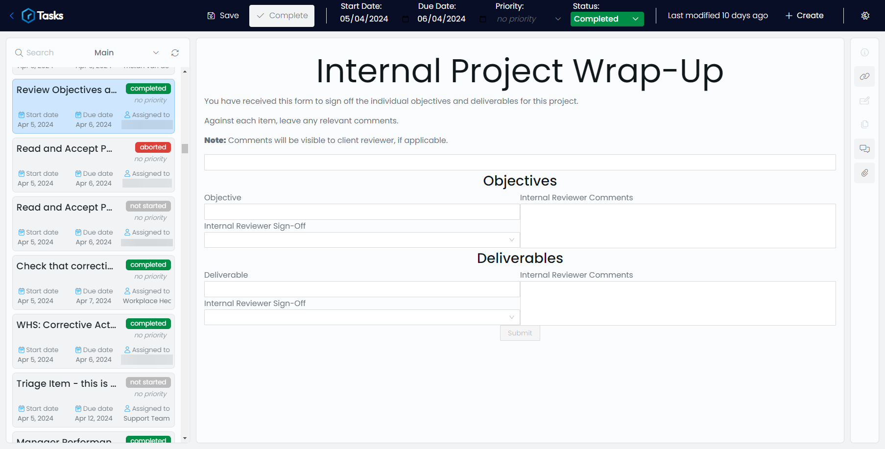
Below is an explanation of the additional UI elements that are present when viewing a Task.
Menu Bar
This is the dark blue heading bar across the top of the site. Here, you can edit certain system columns that are attached to the Task's item.
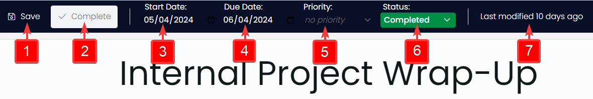
- 🖫 Save
Clicking this button will save any changes made to the current task.
- ✓ Complete
Clicking this button will do several things:
- Start Date
This is the date when the Task's work is expected to begin, or when the task was created. Note that you can click the date to change it. You must Save your changes for the new Start Date to take effect.
- Due Date
This is the date when the Task's work is expected to be completed. Note that you can click the date to change it. You must Save your changes for the new Due Date to take effect.
- Priority
Here you can set the optional priority of the task. By default, these choices are: Low, Medium, High, and Critical. These choices are colour-coded.
- Status
Here you can set the status of the task. By default, these choices are: Not Started, In Progress, On Hold, Completed and Aborted. These choices are colour-coded also.
- Last Modified
This data cannot be edited directly. It communicates when the last change to the task's data was made. If you make changes and save them, then this text will be dated to read: "Last Modified Today".
It is important to note that any changes made to the Task's Menu Bar, or to the fields in the Adaptive Form, will also appear in the Explorer view of the item, and vice versa. For changes to appear, you will need to refresh the item.
Tasks Sidebar
The Tasks Sidebar only appears when viewing a Task. Here, you will find additional data that has been included in the item, such as:
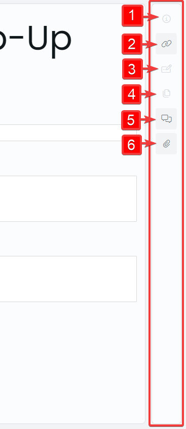
Pressing any of these buttons will open a side panel where additional information can be viewed or manipulated. Each of the sidebar buttons' functionality is discussed in the table below:
| Label | Functionality | Screenshot |
|---|---|---|
| 1 | Description: Any text written into the Description field of the Task via Explorer will appear in the side panel as static text. | 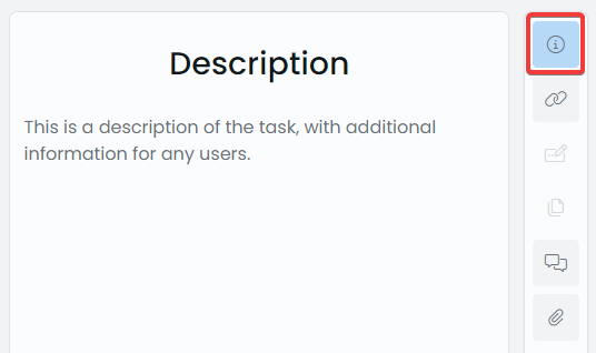 |
| 2 | Linked Items: Any Workflow processes, Universal Links, or Scoped Links will appear here. Note that this panel has similar functionality to the Linked Items menu button. The panel also allows you to visit linked items using the "go to item" button at the end of the Linked Item's name. (What is a Linked Item?). | 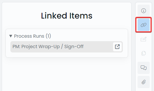 |
| 3 | Embedded Forms: If the item has an Embedded Form, it will appear here. Note that you can add data to the embedded form, and save the Task for this data to be saved to the Task item. (What is an Embedded Form?). | 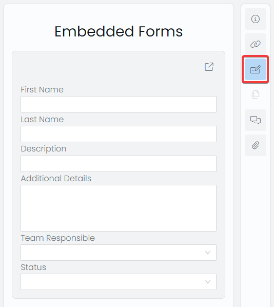 |
| 4 | Embedded Files: Any Embedded Files will appear here in the panel. Note that there is a download button so that the file can be downloaded to your device. (What is an Embedded File?). | 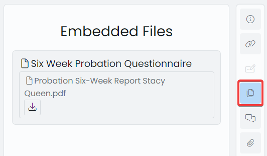 |
| 5 | Activity Feed: This presents the task's Activity Feed in the side panel. Any changes to the Task are listed here. (What is an Activity Feed?). | 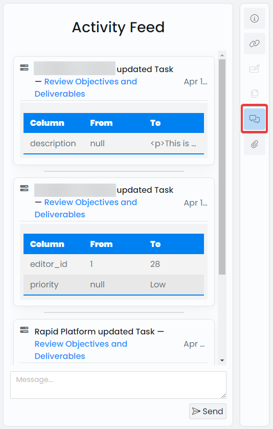 |
| 6 | Attachments: Any file Attachments will appear here in this side panel. Note that at the bottom is a space for you to drag-and-drop files or upload files using your file browser. If a file is uploaded, and the Task is saved, the file will become an attachment to this Task. (What is an Attachment?). | 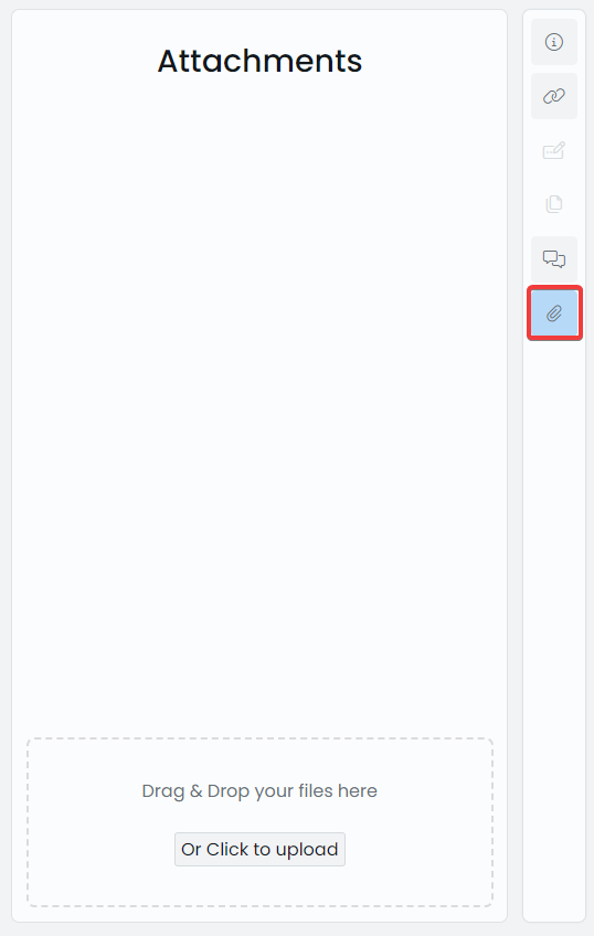 |
Tasks Sidebar Alternative
When the screen is a narrow width, the Tasks application will scale to compensate. In this mode, the Sidebar will appear at the bottom of the web application inside of on the side.
The button icons are identical to before, with the addition of a large blue "list" button on the far left. This button opens the List Toolbar.

Completing Tasks
There are two methods for completing a task via the Tasks Experience.
Pressing the Complete Button
- Go to the Menu Bar of the Tasks Experience
- Press the ✓ Complete button.

Changing the Status to "Completed"
- Go to the Menu Bar of the Tasks Experience
- Press the Status drop down menu.

- Select "Completed" from the list of options.

- The Status should now appear green, with the word "Completed" inside

- Save the Task using the Save button in the Menu Bar.